How I made my app logo with AI
While developing my ssh app Legio, I reached a point where I saw the need to create an icon for it.
I asked Claude Code to add a logo for the app in Xcode. It did the predictable basic thing.
I used that logo provisionally for a good while during development, but I always kept in mind that I would create a final logo.
Prototyping
My goal was to create something abstract. Some symbol that evoked the idea of the app: controlling simultaneous agents from a smartphone.
I thought about hiring a freelance designer, but I realized that I wouldn’t even know what to ask for. So I saw that I needed a brainstorming session. I opened the Claude chat and started throwing out related terms.
Ideas for logos. App name: Legio. References: Agents, Tmux, Cloud, Remote, Multiplexer, Terminal, Shell
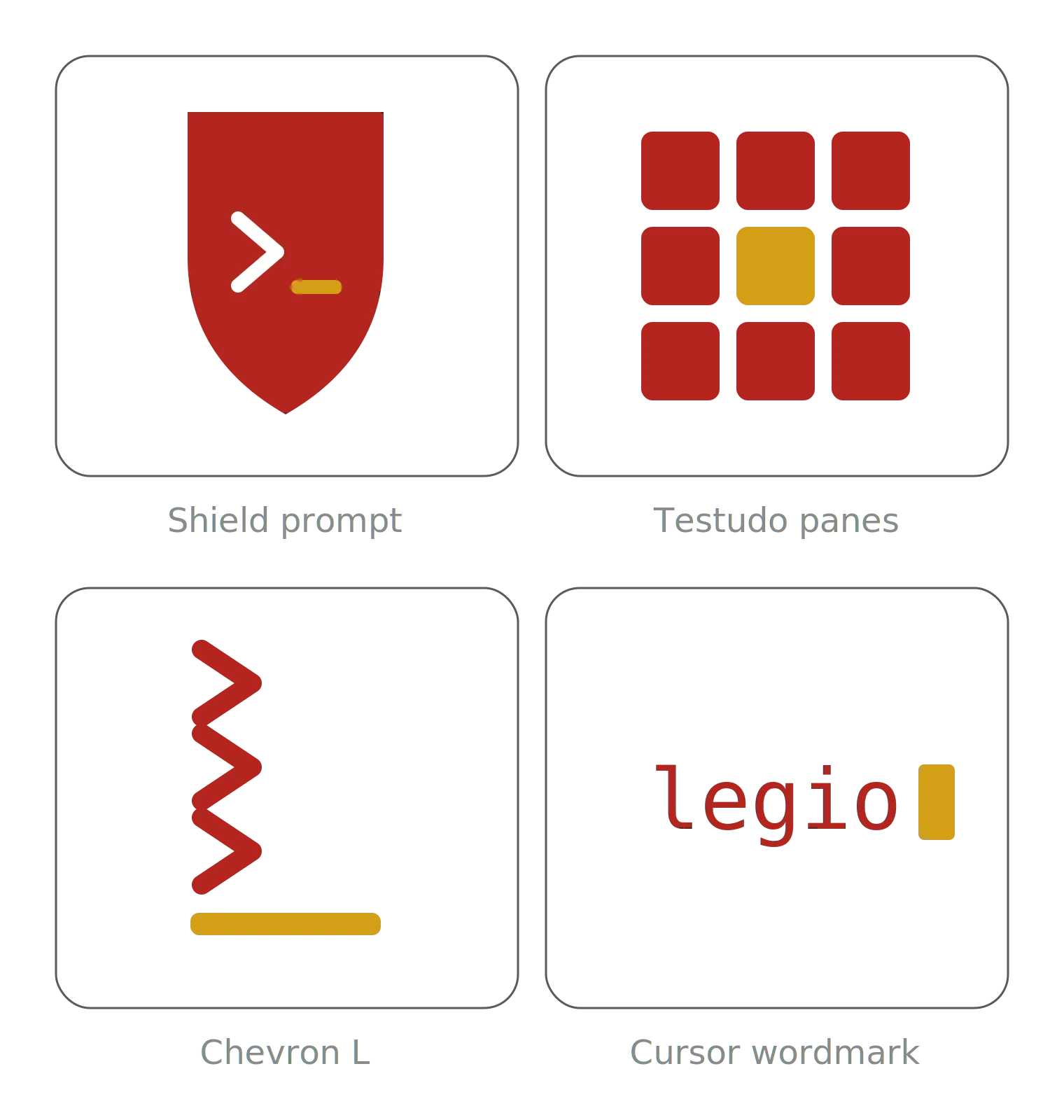
I first noticed that all the logos were SVGs written by Claude. This is great, because instead of storing pixels, this format stores text with the vector information for how to rebuild the logo. This way, I can easily make adjustments with AI, version it with git, and, in the end, convert it to any image format at whatever resolution I want.
Of the 4 options, I found the second one promising. It connotes a representation of the human in the loop surrounded by agents.
In the next prompt, I attached a screenshot of one of the app’s screens to converge the styles.
I like only the testudo panes. Make variations with colors, filling and adding connections between squares. Show me a grid with 9 variations
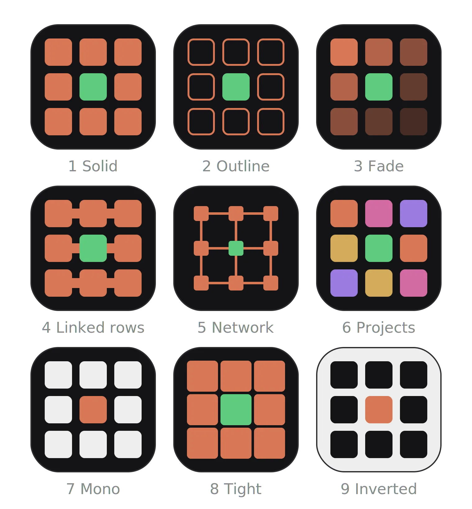
7 fade is the best one. But instead of fading, make only the corners dark. Experiment with different hues, please. Aim for less brightness. Make 9 variations
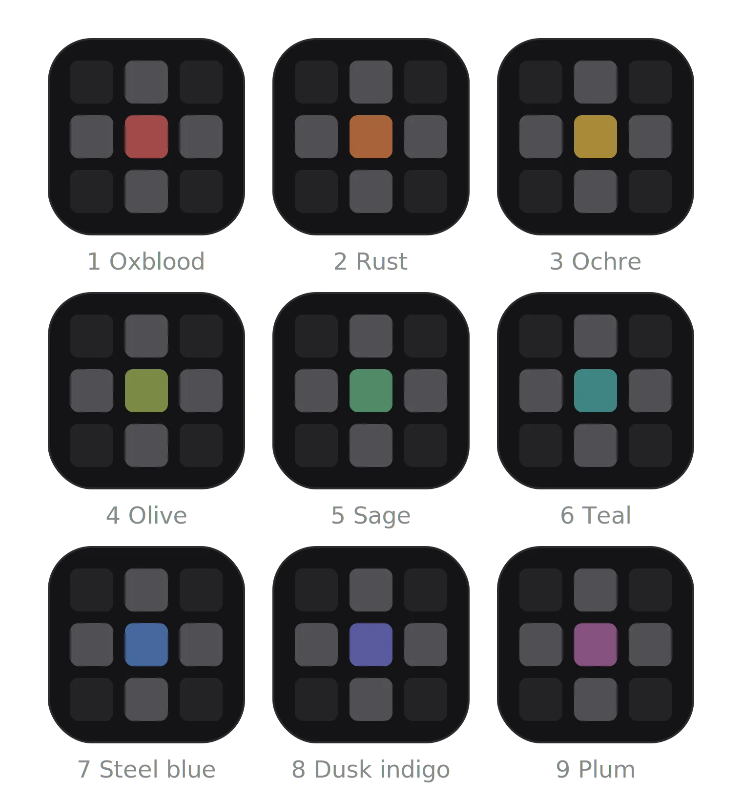
At this point I was already satisfied with the result. I asked it to generate an SVG of the logo in blue, opened a repository, and handed it to Claude Code to apply to the Xcode project. But when I installed the app with the new logo, the result displeased me quite a bit.
Showcase
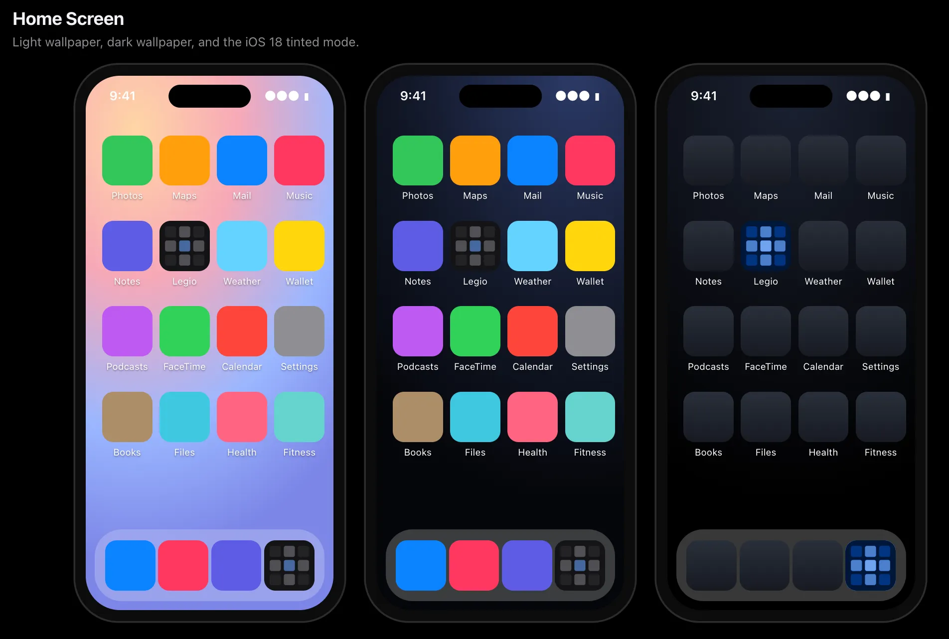
I discovered that, among other app icons, only the cross shape of my logo stood out. The idea of the agents around the human in the loop got lost.
I then asked Claude Code to create an HTML page with a showcase of my logo in different contexts. This completely improved my critical eye when judging the logo in a more realistic context.
Also, inspired by the Tailscale logo, which forms a “T”, I thought about forming an “L” with the squares of my logo while keeping the monochromatic theme.
Use monochromatic colors and highlight the first column and last row to make the effect of a “L”. Create an HTML page showcasing the logo.
I was quite happy with the result!
Afterward, I asked it to generate the logo suite, to have it in every size and format, and also to generate the file for Apple’s Icon Composer. This way, the logo was ready for any icon variation iOS might require.
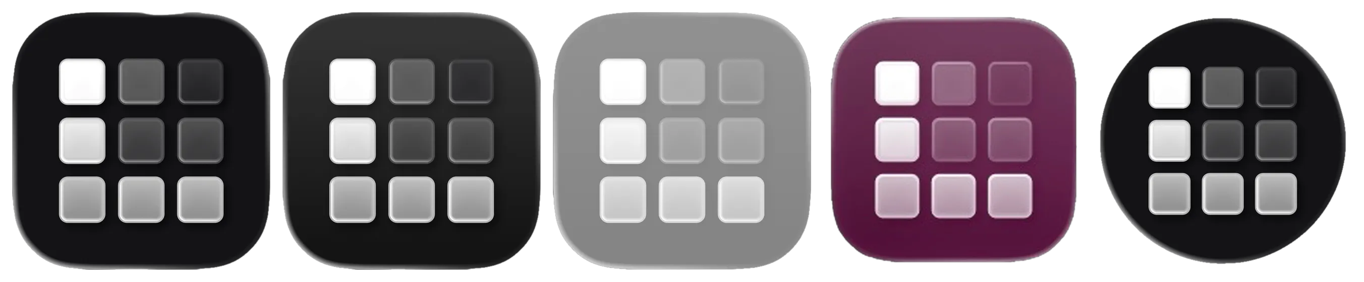
Lessons
The real trick for me was asking Claude to build the showcase. That greatly increased my ability to evaluate the logo and ended up giving me the idea for the final logo. In an environment without AI, the showcase would take a few hours (or a few hundred dollars), and ideally should be avoided before the final stretch of a project because of the time and money costs. But for Claude, this is as trivial as generating the logo itself.
Judging AI effort based on human effort is a false equivalence. High-fidelity prototypes end up being cheaper than low-fidelity ones. I realized that, in this ideation process, I should have tested with the showcase a few steps earlier. That ended up costing me time and tokens.
Likewise, the initial logos could also have been explored further. The first logo grid was 2x2. Then I increased the experiments to a 3x3 grid. I kept that limit because I thought that, above 3x3, the jump would be from 9 experimental logos to 16, a feat that’s much harder for a human, and, unconsciously, I attributed the same effort to the machine. False equivalence. For a future project, I’ll start right away with 4x4 or 5x5 grids.
Bonus
This logo also inspired this blog’s logo, as you can probably tell: the same 3x3 grid of squircle system, but with the middle column and the bottom-left square lit up to form a “J” instead of an “L”.